UI Challenge
Today I embarked on my journey of getting better acquainted with Figma. I can do most stuff and get around, but I want to be better than that… I want to be great. Therefore, I’ve narrowed it down to 3 main areas that I need improvement.
- New tokenization features
- Advanced interaction animation
- Pixel perfect screens using auto layout
I used to be a whizz on Sketch and version control software Abstract. That was my jam but along came Figma and hit it out of the park. So now I need to stop complaining about learning yet another new tool and just get on with it.
So here we go…
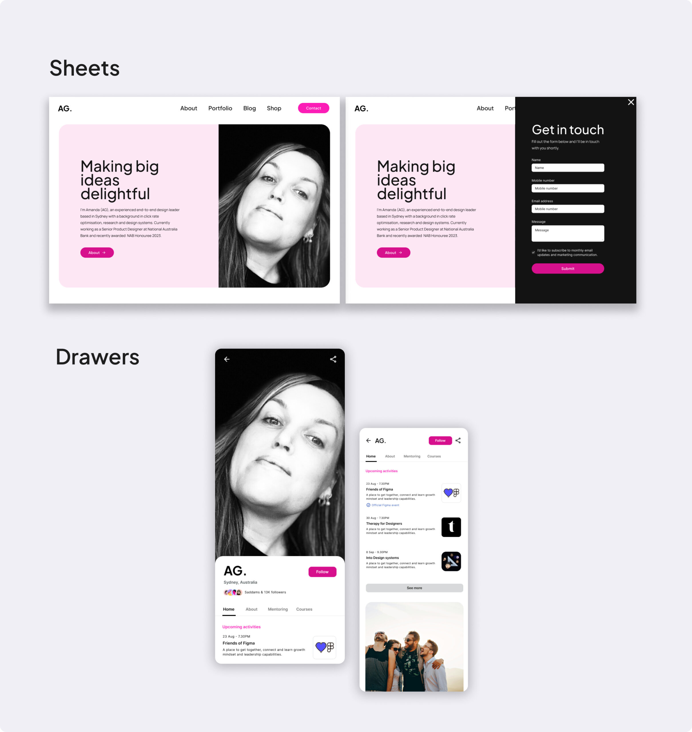
Drawer & Sheet
Imagine creating a mobile application that includes navigational components like a Drawer and Sheet. These elements are versatile UI components used to present information and options in a seamless, intuitive way.
The Drawer typically slides out from the side of the screen and contains a list of navigation links or options, acting as a space-saving menu.
Conversely, the Sheet slides up from the bottom of the screen and often houses options or extended content related to the current visible content, offering a smooth transitional interface for additional information or actions.
“Highlight usability by creating a Drawer that’s easily accessible and a Sheet that complements the content without overwhelming it. Enliven the experience with subtle animations and responsive design.”